
While working on a re-do of a website, I had to create a desktop layout like this:
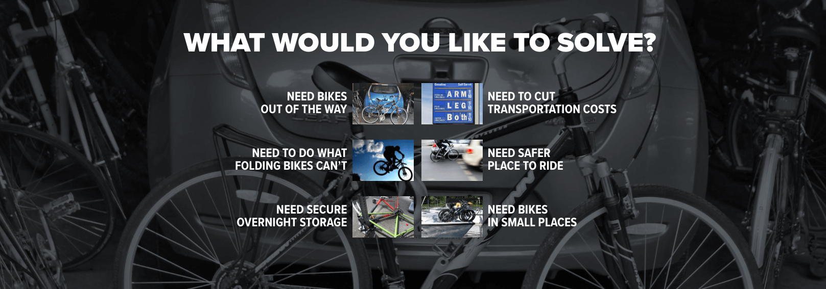
I wanted to just be able to iterate over the list of link, keeping the order of text and images the same. In other words, I did not want the HTML to change order.
With modern browsers, a nice solution was to use FlexBox.
The HTML is straight-forward with the inner divs repeating:
<div class="home-landing-links-container"> <div class="home-landing-links odd"> <a href="..."><span>NEED BIKES<br />OUT OF THE WAY</span></a> <a href="..."><img src="..." alt="NEED BIKES OUT OF THE WAY" /></a> </div> <div class="home-landing-links even"> <a href="..."><span>NEED TO CUT<br />TRANSPORTATION COSTS</span></a> <a href="..."><img src="..." alt="NEED TO CUT TRANSPORTATION COSTS" /></a> </div> </div> |
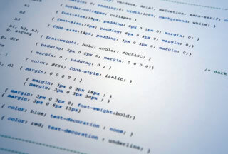
The CSS targets a browser width of 970px or larger. A smaller screen will just stack the items.
@media only screen and (min-width: 970px) { .flatbike-home a { margin-bottom: 0; } .flatbike-home .home-landing-links-container { display: -webkit-box; display: -moz-box; display: -ms-flexbox; display: -webkit-flex; display: flex; -ms-flex-wrap: wrap; flex-wrap: wrap; -webkit-justify-content: center; -moz-justify-content: center; -ms-justify-content: center; -ms-flex-pack: center; justify-content: center; } .flatbike-home .home-landing-links { -webkit-box-align: center; -moz-box-align: center; -ms-flex-align: center; -webkit-align-items: center; align-items: center; display: -webkit-box; display: -moz-box; display: -ms-flexbox; display: -webkit-flex; display: flex; margin-left: 0; margin-right: 0; text-align: left; } .flatbike-home .home-landing-links.odd { margin-right: 15px; text-align: right; } .flatbike-home .home-landing-links.even a:first-child { -webkit-box-ordinal-group: 2; /* OLD - iOS 6-, Safari 3.1-6 */ -moz-box-ordinal-group: 2; /* OLD - Firefox 19- */ -ms-flex-order: 2; /* TWEENER - IE 10 */ -webkit-order: 2; order: 2; } .flatbike-home .home-landing-links.even img { margin-right: 10px; } } |
In the above code, flex-wrap on the parent container forces the items to wrap onto the next lines while justify-content puts the items in the center. On child divs, setting the order on the “even” item is what pushes the text after the image.
You can check this out at flatbike.com

-0 Comments